
CAKE literary
Using design + illustration to establish a sophisticated, professional look for CAKE Literary, a boutique book development firm dedicated to bringing handcrafted, high concept stories to children, middle grade, teen, and women's fiction audiences.

case studies / cake literary

Styled photography by Blueprint Society
services
Website Design (x2!)
Brand Design
Custom Illustrations
Collateral Design
Brand Design
Custom Illustrations
Collateral Design
deliverables
Custom Bootstrap website + WordPress blog (Site #1)
Custom Wordpress website redesign (Site #2)
PDF proposal designs (CAKE + additional imprints)
Branding for CAKE Literary imprints
Promotional materials for book launches
Custom brand illustrations for website(used for hero images, spot images, and animated icons)
Custom Wordpress website redesign (Site #2)
PDF proposal designs (CAKE + additional imprints)
Branding for CAKE Literary imprints
Promotional materials for book launches
Custom brand illustrations for website(used for hero images, spot images, and animated icons)
in collaboration with
how it started
I was fortuitously connected with the founders of CAKE Literary, Sona Charaipotra and Dhonielle Clayton, through Julia Kuo, an illustrator + collaborator who’d just worked on their logo design. They needed a graphic designer to create branded in-house proposals for presenting book concepts to interested publishers.
the challenge
When Sona and Dhonielle first came to me with their needs a few years ago, the business was literally brand new, with no website and only a logo to their name. But they had an incredible amount of heart and an amazing mission of bringing fresh, unique voices to the YA publishing world. I was excited for the possibilities in what we could create together.
In the very short term, they knew they needed the right kind of design and presentation for materials that were sent to potential publishers. But they also had a potential roadmap for CAKE’s future which included expanding into ambitious directions, like spinning off multiple imprints for children, middle grade, and women's fiction, alongside their initial focus on teen reads, and getting into the digital realm. This meant making progress toward long term goals as well, like creating the right kind of online home for their business and to develop the overall look and feel for their brand with an eye on what was to come. The CAKE brand would need to have room to stretch and grow as the business grew, without diluting or compromising brand integrity.
the process
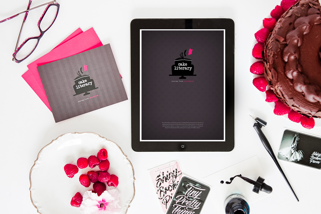
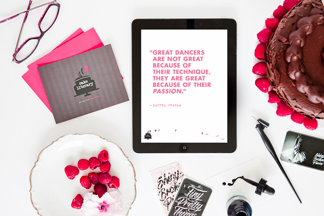
Sona and Dhonielle had a keen sense of what was missing in their industry and they came to the table with focused goals and an abundance of great ideas. Our initial collaboration started with their most immediate need: proposal design. Because their business dealt directly with publishers reviewing numerous proposals a day, they needed something that would get their projects to the top of the proverbial pile. This was an opportunity to make a strong brand statement, so almost immediately, we started to sketch in the missing pieces of what the CAKE brand could be: sophisticated, smart, with a dose of playfulness reflective of the audiences their stories were meant to connect with. Transforming simple Word documents into professional, beautiful PDFs that immediately grabbed publisher attention was great, but more importantly, we were taking CAKE Literary away from just a simple logo and toward becoming a realized brand.

Using the original logo and color palette as a launching point, it was a steady effort of building the brand out further with a rich mix of patterns, a better defined style guide for the typography as well as other layout elements, and new original artwork by illustrator Emily Dove, which helped infuse the perfect blend of sophistication and playfulness the brand needed.

Before and after redesigning existing brand elements.

Rough layouts for the first CAKE website.
All of these updated brand components, but particularly the illustrative storybook direction of Emily’s artwork, played a central role in my first custom website design for CAKE. The style of the website was deeply inspired by the original proposal design and we set out to make the site a natural extension of the materials publishers were already seeing and the new spot illustrations and icons developed for the site went a long way toward furthering the visual story of CAKE and what they were all about. It added a fantastic dimension to the overall aesthetic, and felt tonally on point with the personalities of the women behind the operation.
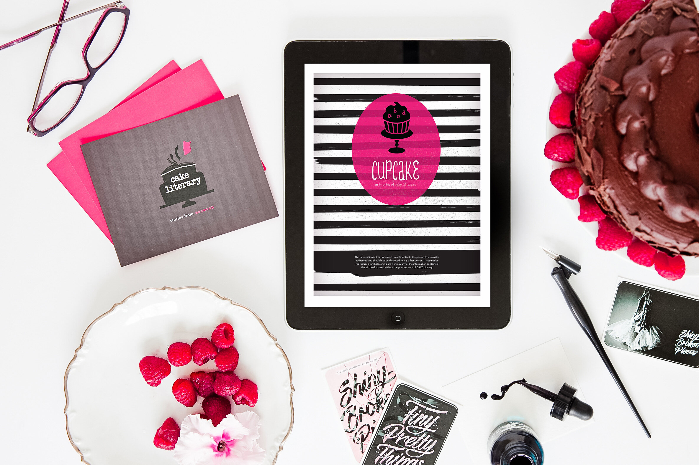
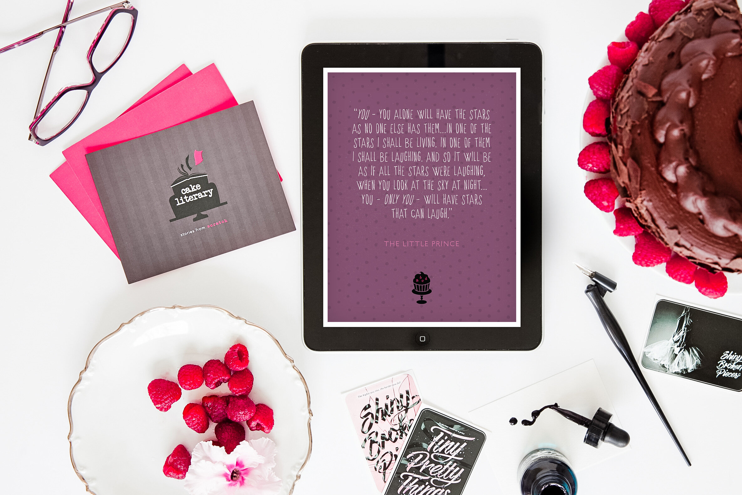
At the same time, we were beginning to see the seeds of those future plans beginning to grow, starting with realization of the Cupcake imprint for middle grade readers! Because this material for this audience would skew younger, Sona and Dhonielle wanted to see Cupcake as a sub-brand for the mothership, maintaining the general colors and essence of CAKE, but filled with a lot more whimsy, playfulness, and brighter tones.

Experimenting with pattern elements for Cupcake branded backgrounds.

Brand patterns for the Cupcake imprint.
This led to another set of beautifully branded proposals for the Cupcake imprint and a customized imprint page on the website, the first of many as CAKE Literary eventually spun off more imprints like Cake (teen), Layer Cake (women’s), and Cake Pop (film and television).
Style tile explorations for the CAKE website redesign
One last notable highlight from the overall process of working with CAKE: the most recent redesign of the original website. This was a few years since we launched the first version and while the site itself was still beloved and functional, it felt like CAKE was ready for another evolution. Requirements for this redesign included brightening up the overall tone without losing the core of the original branding, streamlining the layout and functionality of the site itself to something more user friendly, and ensuring it was easy to make updates on the backend without the help of myself or a dev. I immediately turned to one of my regular Wordpress developers, Megan Garwood, an absolute pro at coding my designs into beautifully functional sites that were a snap for clients to update. Working on this website redesign highlighted how much CAKE had grown since those early days and challenged me to break apart my own work and find ways to make it better.
the results
The results for CAKE Literary span a much longer period of time than most other clients — but being able to see how the brand has evolved through five years of design work is a real treat. The collaborative spirit and passion of Sona and Dhonielle’s partnership transferred easily to their role as clients and I’m grateful for their positive energy. I look forward to seeing what CAKE bakes up in the next five years!

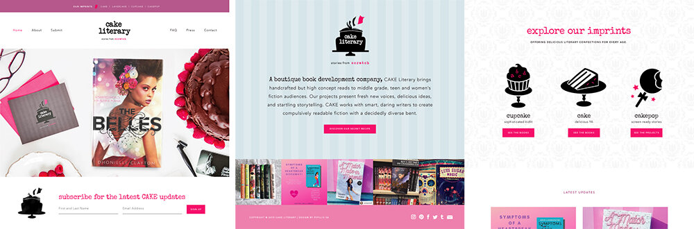
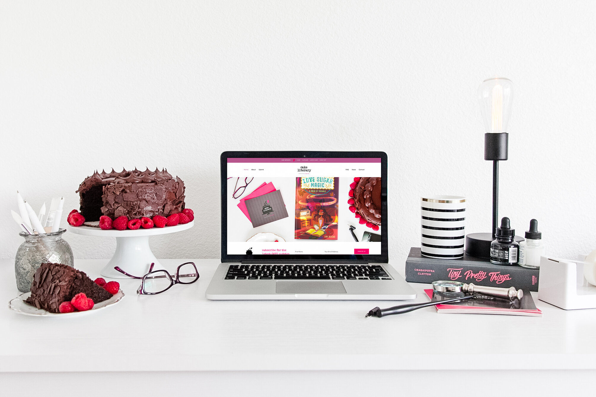
Desktop layouts from the original website design
Website icons by Emily Dove

Spot illustrations by Emily Dove

Different imprints - all sub-brands under the CAKE Literary umbrella

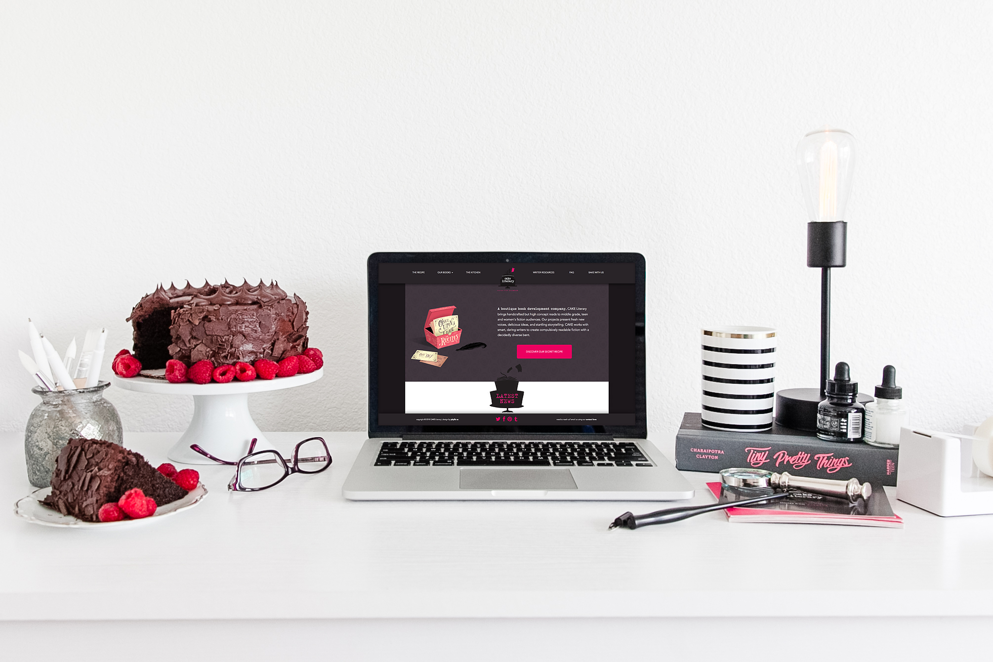
Desktop layouts from the most recent website redesign
in dhonielle's own words
Did you have any concerns about hiring a designer? How did those concerns stack up with the reality?
I had never worked with a designer before hiring Phyllis. I was worried that I wouldn't be able to translate the vision in my head to another person. But those fears proved to be unfounded.
what was your favorite part of working together?
Phyllis is a wizard, specializing in the power of mind-reading and manifestation. She just gets me and my aesthetic. I tell her my crazy ideas -- well, more like harass her with dozens of emails -- and she's able to translate them. My favorite part of working with her is the way she brainstorms. I like how collaborative she makes the process.

All details were considered on the mobile responsive version of the new website
What is the greatest benefit you've received from our work together?
What Phyllis created for my business catapulted us in our industry. We get compliments on the website and our materials constantly. We would have no brand if it wasn't for Phyllis, and our brand wouldn't have the sleek, sophisticated and whimsical reputation it now has. I'm obsessed with our website and all the PDFs we send out as a company because I know they look expensive, well-crafted, and polished. In an industry that values aesthetics, CAKE Literary has been put on the map.